Domaine Home – Step inside a ’30s Hollywood Hills Estate


Step Inside a '30s Hollywood Hills Estate

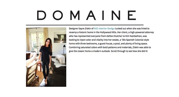
Designer Sayre Ziskin of SVZ Interior Design lucked out when she was hired to revamp a historic home in the Hollywood Hills. Her client, a high-powered attorney who has represented everyone from Ashton Kutcher to Kim Kardashian, was looking to inject color and vitality into her estate, a ‘30s Spanish Colonial-style home with three bedrooms, a guest house, a pool, and plenty of living space. Combining saturated colors with bold patterns and materials, Ziskin was able to give the classic home a modern outlook. Scroll through to see how she did it!

  • Classic black and white entry

    Seeking to create a space that was both sophisticated and kid-friendly, Ziskin got to work.
  • Neutral living room

    “To me, this house has a joyfulness and strength that really encapsulates my client herself,” says Ziskin.
  • Mezzanine in living room

    In the living room’s mezzanine the designer opted to paint the existing built-ins a deep forest green, creating a solid backdrop for the otherwise neutral space.
  • Restoration Hardware Belgian Roll Arm Slipcovered Sofa ($1995 and up)

  • Brown and ivory living room

    The formal living room features classic Spanish elements like dark wood ceiling beams and decorative ironwork.
  • Vintage writing desk
  • Checkered floor in dining room

    “My client’s bold and playful fashion sense dictated the interior style of the home,” Ziskin says. “We did not stick strictly to the Spanish style, but strayed in many directions to create a colorful, eclectic, and graphic visual mélange.”
  • Bold seating area

    In the family room, the designer was eager to introduce bold color and unexpected combinations.
  • Bold family room colors

    “I had been dying to use an acid purple and when I brought that fabric to my client for her custom family room club chairs she amazingly agreed to go with my choice,” Ziskin shares. “From that point on I was able to bring in a few more bright oranges and greens throughout the space.”
  • Polished built ins

    The existing built-ins and paneling in the family room were carried through into the new kitchen to create a harmonious flow between spaces.
  • Layered artwork
  • White kitchen with marble backsplash

    After having decided on an Italian-honed granite floor in the kitchen, Ziskin and her client opted for fresh white cabinetry and a mix of marble and soapstone surfaces for a varied look. An industrial fixture over the island adds a hint of old-world charm to an otherwise polished space.
  • Green banquette in a kitchen
  • White and blue bedroom

    In the master bedroom, saturated blue accents enliven the subdued neutral palette.
  • Neutral room with blue accents
  • Dip dyed drapery

     The room’s custom dyed drapery makes for a stunning statement. “These curtains were dipped in giant barrels of purple/indigo dye,” Ziskin tells us. “They took about five months to complete because we had to figure out the perfect solution, the perfect amount of bleeding up on the white, and a machine that could hold up the weight of huge curtains soaking wet. It was a triumph!”
  • Blue bathroom vanity

    Ziskin brought the same creativity that inspired the bedroom’s custom drapery to the bathroom’s out-of-the-box design. The purple-and-indigo vanity references the same indigo color story seen in the adjacent bedroom. “My client was brave enough to do the custom colored vanity that really stands out,” the designer shares.
  • Heart light sign in a bathroom

     A custom heart-shaped light fixture over the clawfoot bathtub gives the space an industrial feel, which is echoed in the doors of the shower and water closet.
  • Iron door shower

    “The master bathroom bridges the gap between the colorful family room and the muted living room,” says Ziskin. “It’s a bit of both worlds.”
  • Outdoor seating and dining areaOutside, multiple seating and dining areas give the home a stately feel.
  • Stone archway in a garden

     Though an undertaking of considerable size and scope, Ziskin would do it again in an instant. “I enjoyed every minute,” the designer happily says.

    Are you a fan of using saturated colors in unexpected places? Share with us below!